Album Artwork Design
Below is the collection of album artwork that I've created for Tecala throughout the years.


Marketing Materials
Music Marketing
In addition to creating album artwork for Tecala, we also focused on creating a few graphics to help marketing his services.
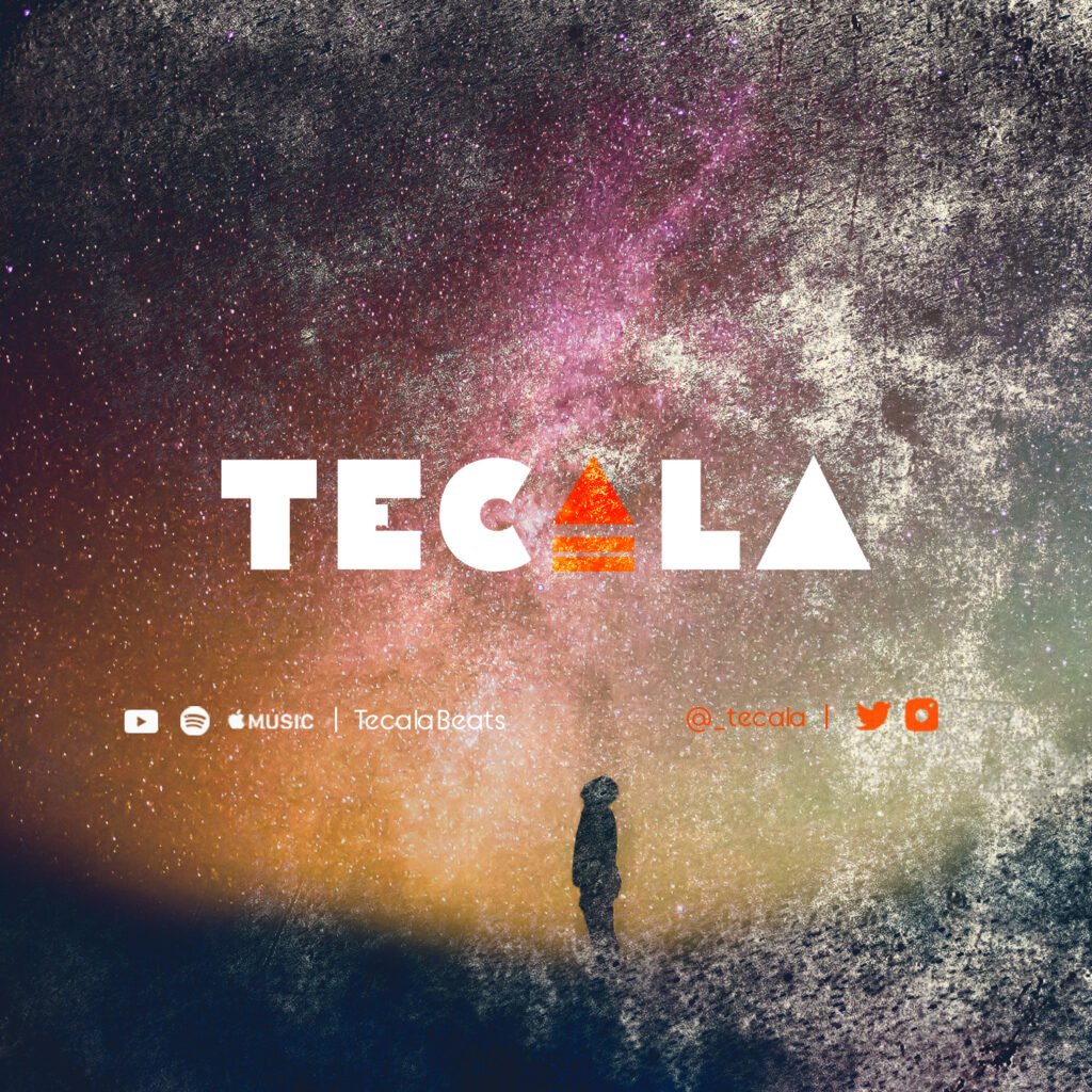
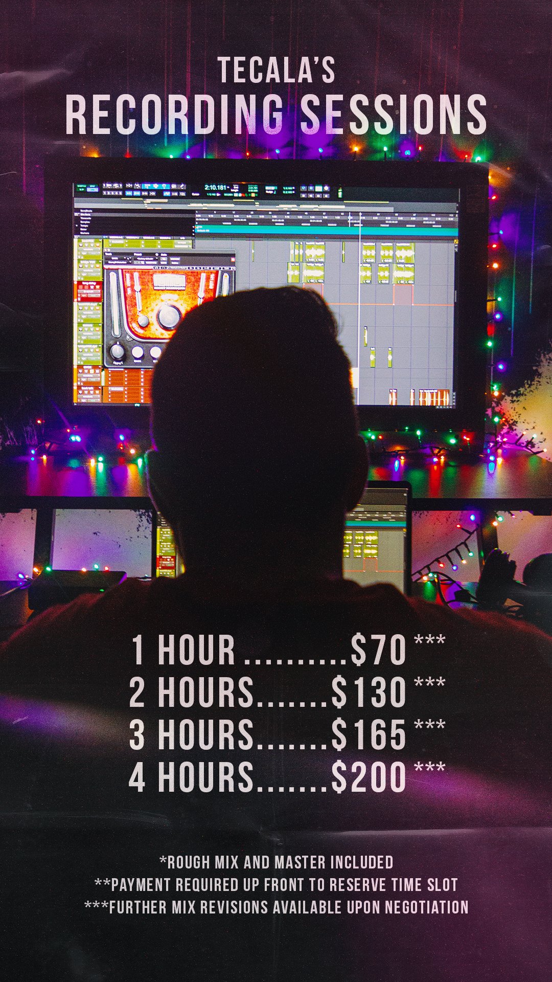
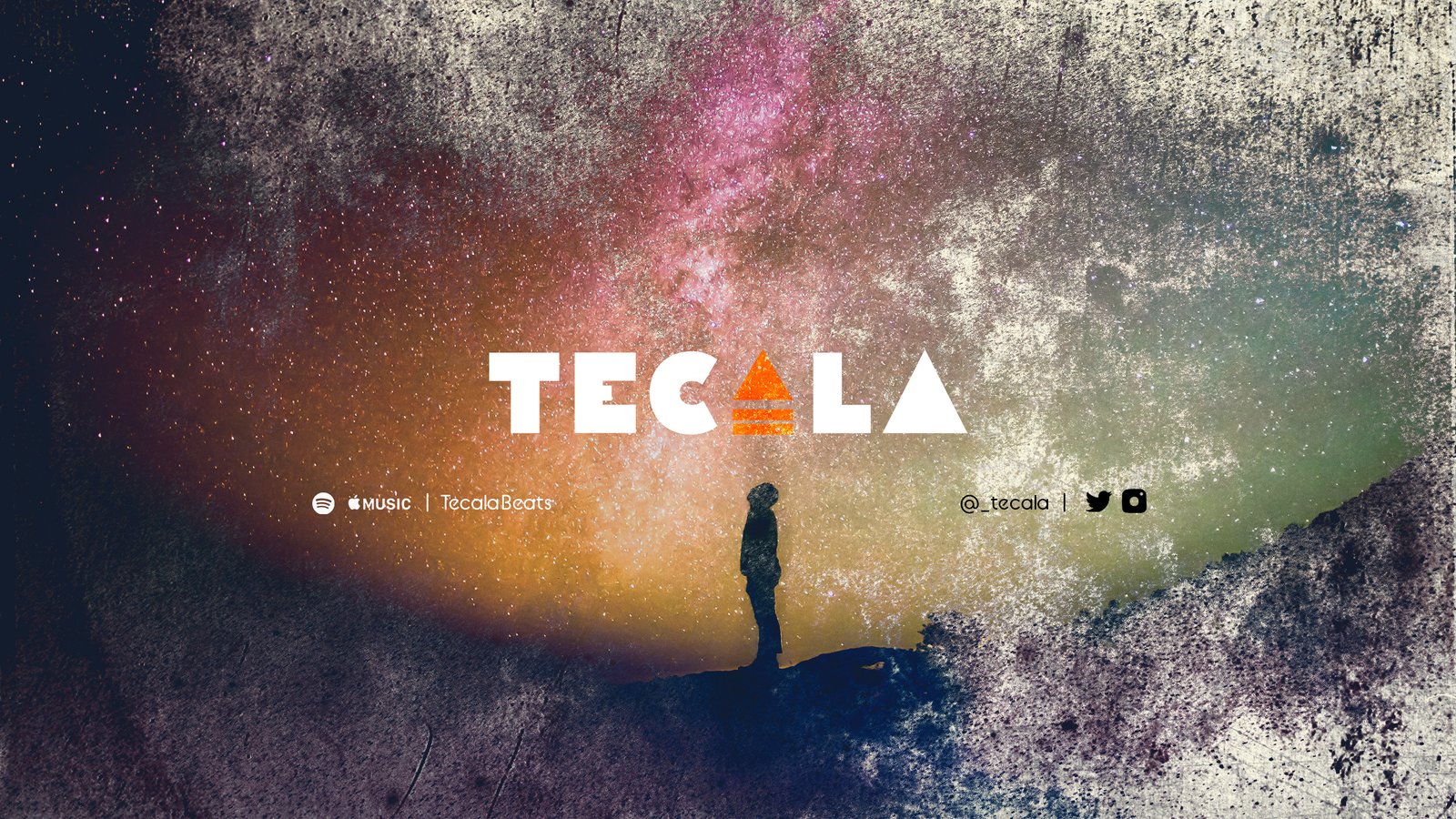
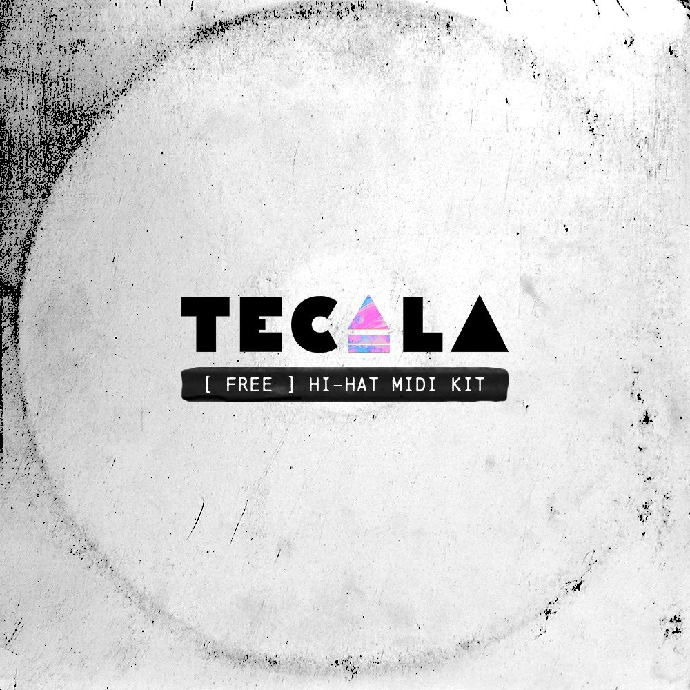
We created a new logo for him to use on his social media accounts and beat packs that were being sold. We also created a couple banner images with this new logo for Twitter, YouTube and Spotify so his profiles would look cohesive and complete on those platforms. Finally, we made a couple graphics to promote his recording sessions and mix packages.
These graphics allowed Tecala to finish setting up his social profiles and release his first beat pack for sale.