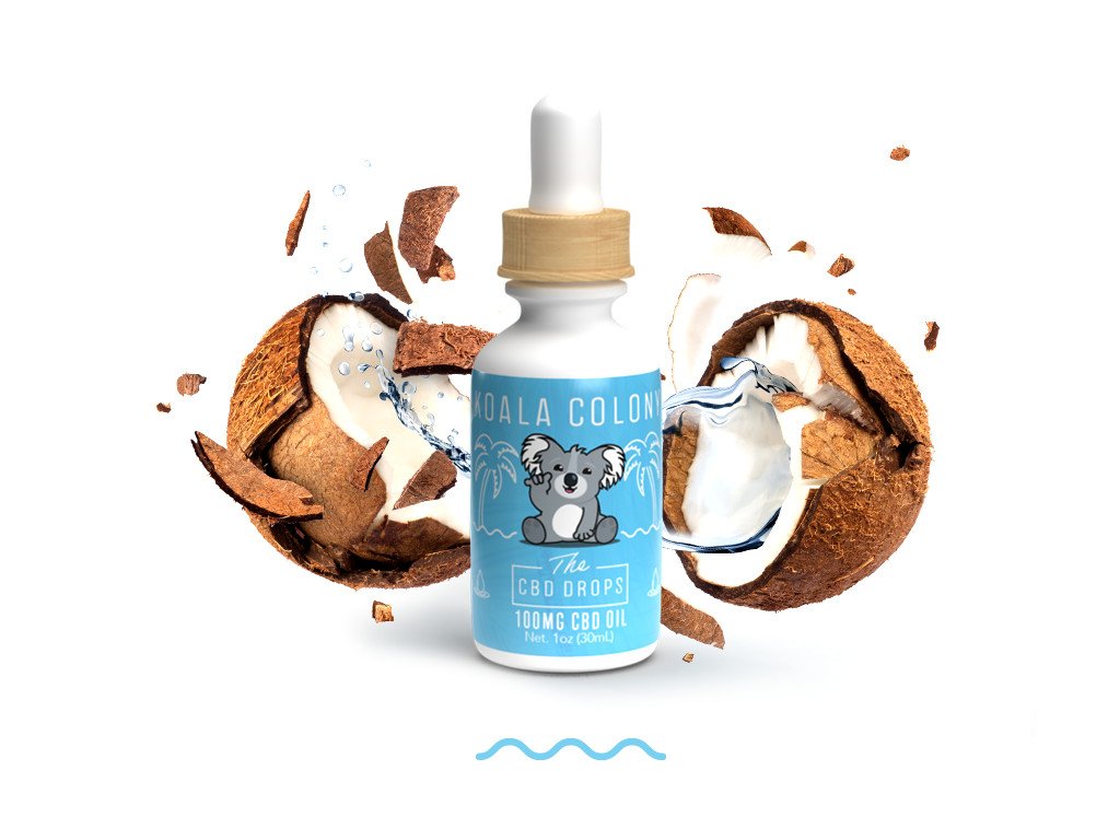
Koala Colony
CBD products
packaging + rebrand ︎
koalacolony.com
project brief
goals:
rebrand hemp house goodies into koala colony with the logo provided
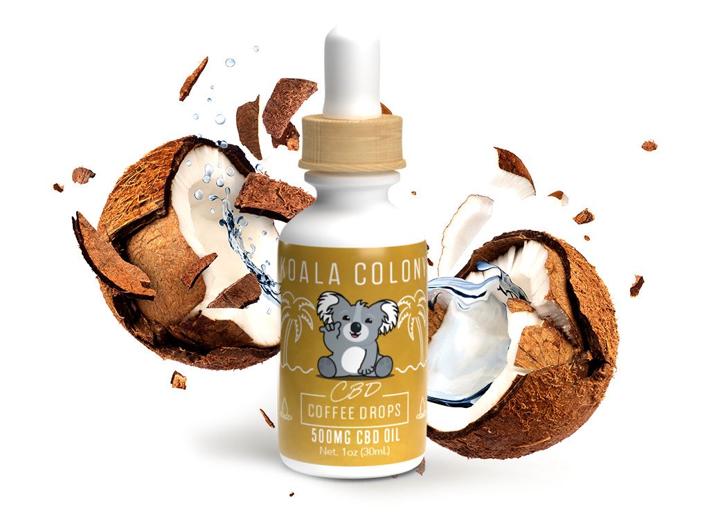
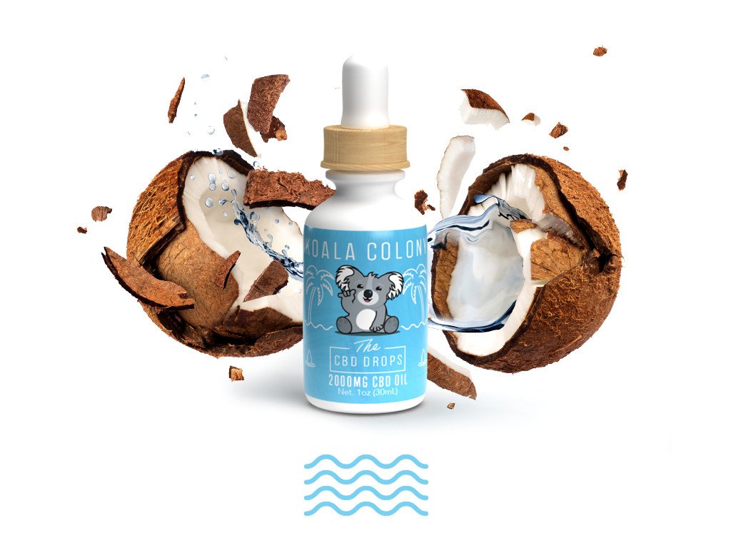
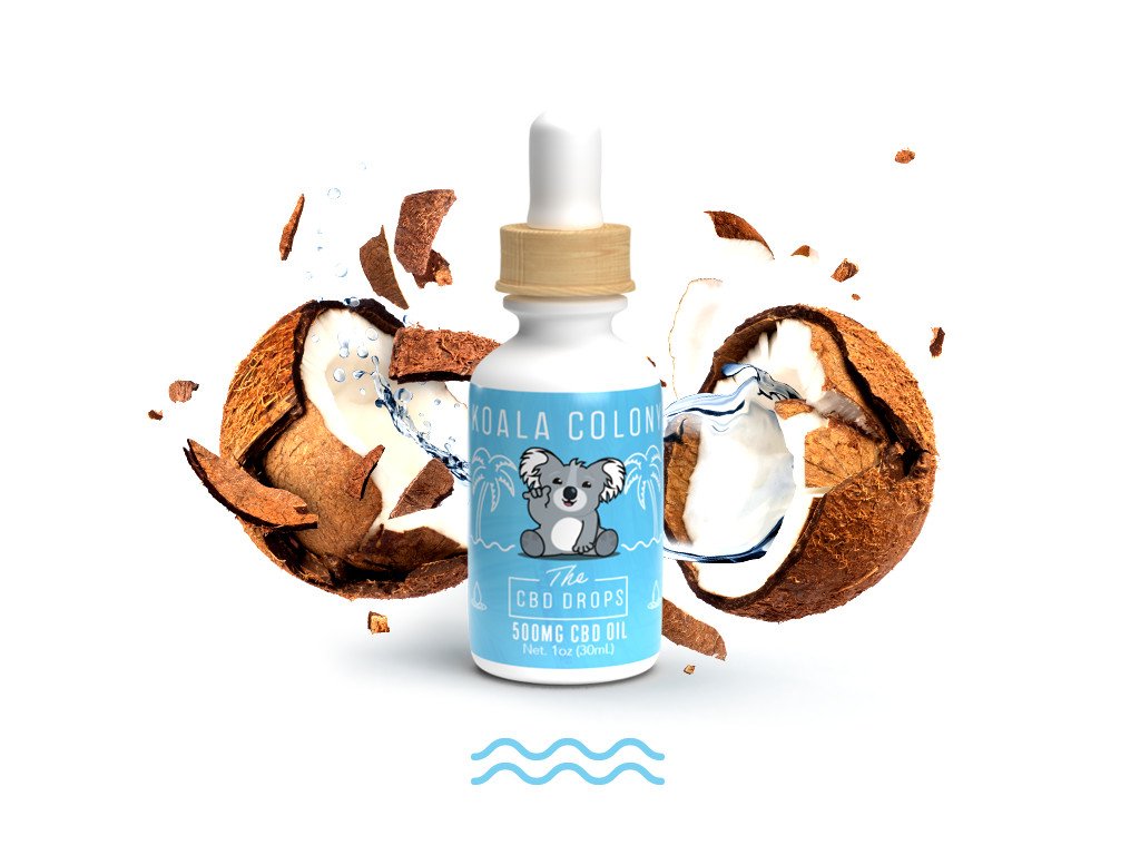
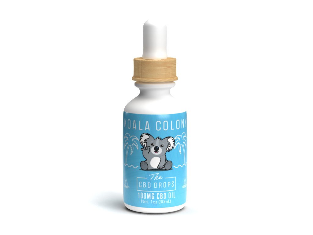
create new packaging for all products with new + improved branding
focus areas:
associates between product qualities and design qualities
improvements to typographic elements and layout
improvements to product renders
constraints:
no cannabis leaves (reduce association to THC)
no manipulation to koala logo (logo done by another artist)
keep color schemes similar to previous brand
___
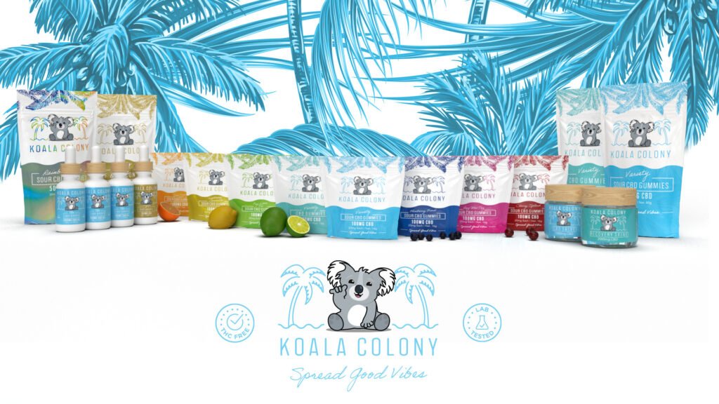
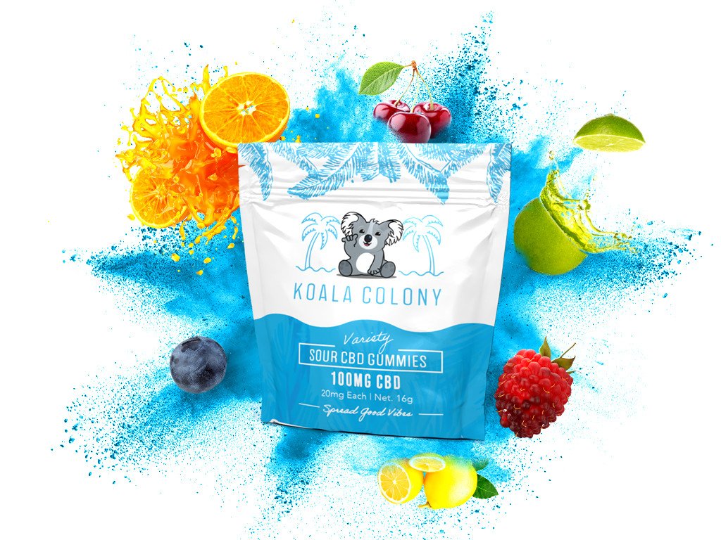
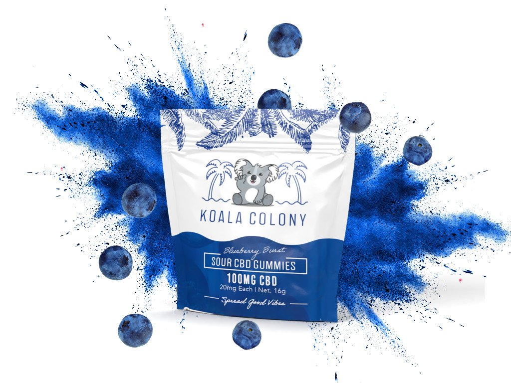
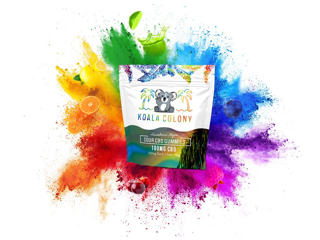
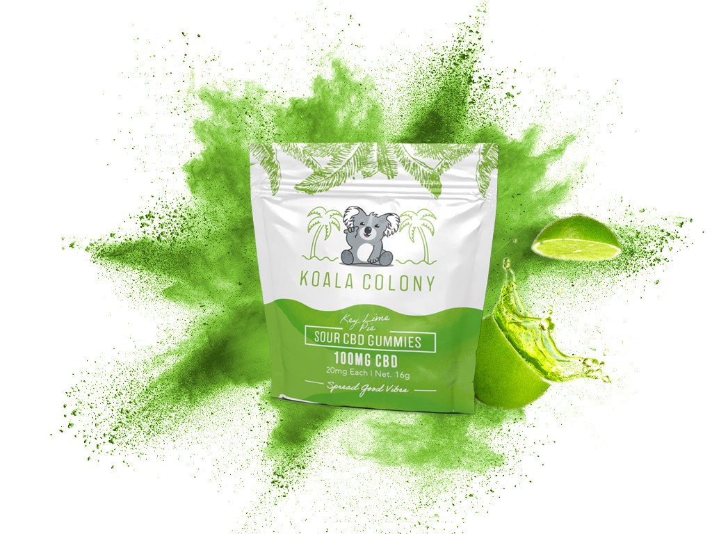
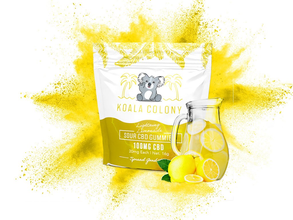
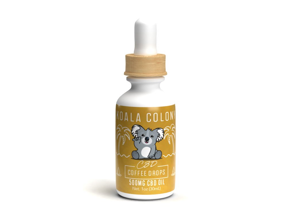
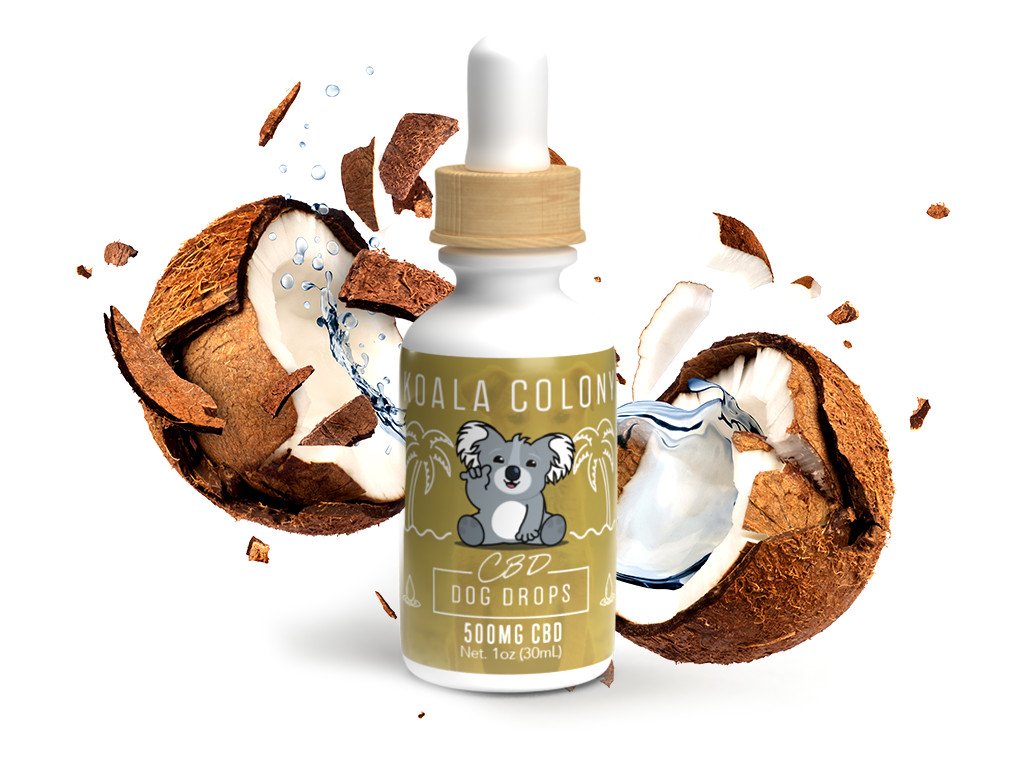
When going about this rebrand, I wanted to keep some of the simplicity from the original design to lend to the refreshing and serene feeling you get from using CBD products. The simple waves were intended to create gentle movement as if you were gliding on top of soft waves on a float. The textures in the designs were all created using photos or illustrations of products of nature. These textures are meant to create an association to the natural medicinal benefits you receive from these products. The final product? A clean, serene, and natural design for a company that represents all of the above.
___
final products
alternate universes
Although the team didn't choose this version of the logo, I wanted to include it in this to show an alternate way the project could've gone. Ultimately the team felt that these palm trees didn't fit their pre-made koala log as well as the other but I liked the way these palm trees tied the top border of the bag in with the rest of the design and took away some of the childish feeling of the logo. While I might like the way this logo worked, the clients did not so it will just have to live on elsewhere.
Another honorable mention that passed by during the design process was this logo iteration. This was one of the early trials I went through before the constraint of no marijuana leaves was set. This design provided a lot of elements for the final design. I include it here because of it's influence on the final piece and, personally, I enjoy this logo for the brand as I think it looks like a graphic you might see on a flag. This idea of a logo on a flag brings to mind an associate to a colony flag for me and further lends to the brand name.